



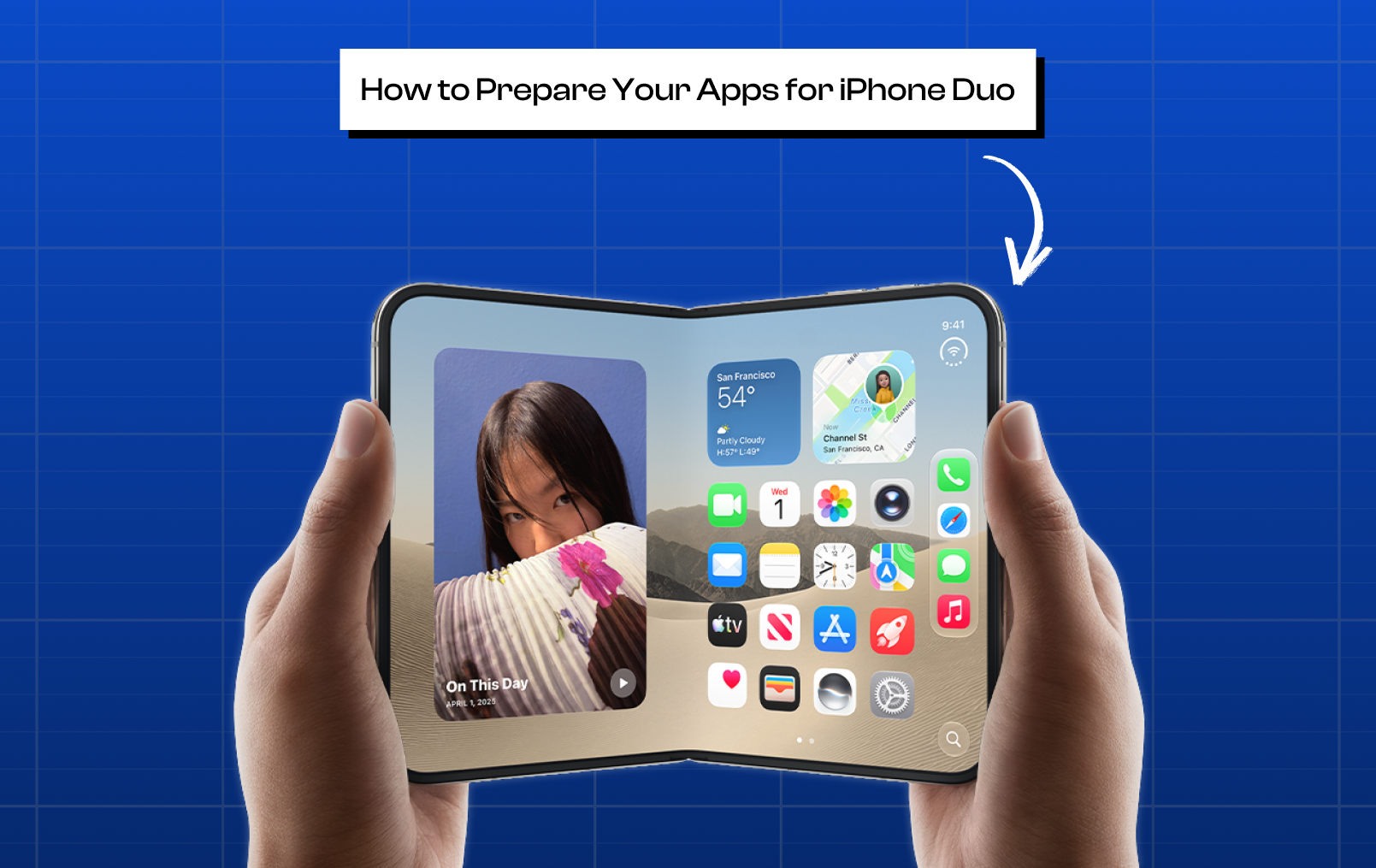
Apple announced its first foldable, iPhone Duo, on September 9, 2026, and it ships October 23. The good news for app developers is that existing iOS apps already run on iPhone Duo without changes. However, apps that rely on fixed layouts, hardcoded dimensions, or older UI assumptions may need updates to take full advantage of its foldable display.
For a mobile app development company, the key is not rebuilding an app from scratch. It is adapting the existing interface to Duo’s new screen sizes, hinge area, multitasking behavior, and camera positions.
This guide explains what changes in iOS app development for iPhone Duo, what you need to update first, and which Duo-specific capabilities are worth adopting.
The four-step version
Your existing app can run on iPhone Duo without recompiling. But recompiling with the newer SDK and replacing rigid layout logic can help your app use the larger display correctly.
Ship nothing today. Your current build already runs on Duo at a standard iPhone layout.
Recompile with the iOS 27.1 SDK. This enables newer layout behavior and helps the app use the available display better.
Replace hardcoded layout logic with adaptive size classes. This helps prevent stretched, clipped, or incorrectly positioned UI.
Adopt Duo-specific APIs—such as hinge detection, split-screen layout containers, and camera-direction handling—when you want a more native foldable experience.
What changes for iOS apps on iPhone Duo?
iPhone Duo has an outer display, inner display, center hinge, and front-facing cameras associated with both displays. The device can be used closed, fully open, partially folded, rotated, or alongside another app in Split View.
That creates several new layout conditions:
Different available screen sizes
Compact and regular size classes
A folding/hinge region
Camera-related reserved areas
Asymmetric safe areas
Vertical toolbars and tab bars
Split View multitasking
Multiple app scenes
More opportunities for two-column interfaces
Different camera behavior for camera-based apps
The important distinction is that these are not separate layouts developers should manually design one by one. Apple's guidance (Human Interface Guidelines: Designing for iPhone Duo) is to use adaptive layout principles so the same interface responds naturally to changing space.
Different available screen sizes:
iPhone Duo has two physical panels. Per Apple's own published technical specifications (apple.com/iphone-duo/specs):

Display | Diagonal size | Pixel resolution | Pixel density |
Inner display | 7.6 inches | 1878-by-2670 pixels | 430 ppi |
Outer display | 5.4 inches | 1398-by-2034 pixels | 460 ppi |
What exactly changes: your app's layout code can no longer assume one fixed canvas size. The same app instance will be laid out against two genuinely different pixel/point dimensions depending on whether the device is open or closed, plus intermediate widths during Split View. Any layout logic keyed to a specific width or height in code needs to be replaced with logic keyed to available space, not a hardcoded number.
Compact and regular size classes:

Apple's guidance (Designing for iPhone Duo — HIG) defines the outer display as compact width and the inner display as regular width, in both SwiftUI's environment and UIKit's trait collection.
What exactly changes: instead of writing if width == X, your layout should branch on horizontalSizeClass / verticalSizeClass. Compact width means one-column, simplified hierarchy; regular width means you may introduce a sidebar, a second column, or additional detail, not that you must.
A folding/hinge region:

When the device is held partially folded, the display curves through a center hinge. Apple calls this a reserved region, queryable through reservedRegion in SwiftUI/UIKit.
What exactly changes: interactive elements (buttons, inputs, confirmation controls) must not sit directly on the hinge, since that area is physically harder to tap accurately. Continuously scrolling content (feeds, articles, chat) is explicitly exempted from this — it doesn't need to be displaced away from the fold.
Camera-related reserved areas:
The under-display FaceTime camera on the inner screen becomes an occlusion region exposed as .occlusion on the reservedRegion value in SwiftUI (or UIViewReservedRegion in UIKit) — only when the camera is actively in use.
What exactly changes: your layout should check whether .occlusion is active via those same reserved-region APIs, rather than permanently reserving space for a camera that may not be running.
What exactly changes: your layout should check whether that region is active (via the same reserved-region APIs) rather than always reserving space for a camera that may not be running.
Asymmetric safe areas:

Safe area insets and layout margins are no longer guaranteed to be equal on opposite edges.
What exactly changes: code that assumes leftInset == rightInset will misplace content. Insets must be read and applied independently per edge.
Vertical toolbars and tab bars:
Standard navigation, toolbar, and tab bar controls can reposition to the side of the screen rather than the top/bottom.
What exactly changes: this happens automatically for standard system components (NavigationStack, TabView, system toolbars) once you rebuild against the iOS 27.1 SDK. Custom, hand-built navigation bars do not get this automatically and need manual auditing.
Split View multitasking:
Two apps can run side-by-side, or two windows of the same app can run at once.
What exactly changes: your app can no longer assume it's always the only thing running full-screen. Layout and state management both need to handle a reduced-width, non-full-screen presentation without breaking.
Multiple app scenes:
iPhone Duo is the first iPhone supporting multiple simultaneous instances of an app's UI in supported scenarios.
What exactly changes: apps that already support multi-window on iPad have a head start. New windows can only be created on the inner display, not the outer one — so a request to create a new scene needs a graceful failure path, not a crash.
More opportunities for two-column interfaces:
The wider inner display allows list+detail, sidebar+content, or player+queue layouts where they fit your app's information hierarchy.
What exactly changes: this is optional, not mandatory. A single-flow screen (an article, a form, a chat) should generally stay single-column even on the inner display.
Different camera behavior for camera-based apps:
There are two physical front cameras, outer and inner, and the "correct" one depends on device state.
What exactly changes: apps that hardcode a specific physical camera will select the wrong one as the phone opens or closes. Apple provides a virtual front camera that switches automatically for common cases, and direction/rotation coordination APIs for custom camera implementations.
What Actually Changes in iOS App Development for iPhone Duo?
Preparing an existing app for iPhone Duo is primarily an adaptive-layout and compatibility update, not a requirement to build a separate “Duo version” of the app.
Apple's guidance is clear: apps should adapt to available space across the outer and inner displays rather than use a separate custom layout for every device pose.
Here are the areas developers actually need to review.
1. Replace fixed screen assumptions with adaptive layouts
What needs to change:
Remove layout decisions based on a specific iPhone model, fixed screen dimensions, or assumptions about a single display.
Common examples that need review include:
Fixed widths and heights
Hardcoded screen coordinates
Device-specific layout conditions
UIScreen.main.bounds used for layout decisions
Orientation-based layout logic
Why:
iPhone Duo can provide different amounts of available space depending on whether the device is closed, open, folded, or running alongside another app.
Apple recommends designing across a continuum of sizes and avoiding display-specific dependencies. For UIKit, use traits and scene-aware geometry; in SwiftUI, use the environment and available layout information instead.
What to do:
Make the layout respond to available space, not to the identity of the device.
2. Use size classes to determine the layout
What needs to change:
Review layouts that assume every iPhone has the same horizontal space or use orientation as the primary layout trigger.
Why:
The outer display provides a more compact experience, while the inner display provides regular-size space suitable for richer layouts such as sidebars and two-column interfaces. Apple specifically recommends using size classes rather than creating a separate layout for every Duo pose.
What to do:
Use compact layouts when horizontal space is limited.
Use regular layouts when additional space is available.
Introduce two-column or split layouts only where they improve the information hierarchy.
Don't assume that every regular-width screen needs to become two columns.
For example:
Compact:
Product list → Product detail
Regular:
Product list | Product detail
The goal is to use the additional space effectively, not simply stretch the existing interface.
3. Replace custom navigation where standard components can adapt
What needs to change:
Audit custom navigation bars, tab bars, toolbars, and split-navigation implementations.
Why:
iPhone Duo can change how navigation and controls are positioned. Apple's standard navigation components are designed to adapt across different Duo configurations.
What to use where appropriate:
SwiftUI
NavigationStack
NavigationSplitView
TabView
List
ScrollView
UIKit
UINavigationController
UISplitViewController
UITabBarController
Auto Layout
Safe-area and layout guides
If the app has a custom navigation system that assumes a fixed bottom bar, it should be tested and potentially redesigned.
4. Review toolbars and tab bars for vertical placement
What needs to change:
Don't assume navigation and toolbar controls will always have to occupy a horizontal bar at the bottom.
Why:
On iPhone Duo, supported system bars can move controls toward the side of the display to preserve valuable vertical space. Apple provides guidance for vertical bars, shared bar regions, item ordering, symbols, and overflow behavior.
What to do:
Give important actions clear priorities.
Use concise symbols where appropriate.
Make secondary actions available through overflow.
Ensure custom toolbar content can adapt to the available bar configuration.
Prefer system bars where they meet the app's requirements.
This is particularly important for apps with many actions, such as dashboards, editors, productivity tools, and media applications.
5. Fix safe-area handling
What needs to change:
Review layouts that assume the left and right safe areas are equal or apply one fixed inset everywhere.
Why:
iPhone Duo introduces additional display regions, cameras, and different configurations. Apple notes that safe areas and layout margins can be asymmetric, particularly when the device is used with multitasking.
What to do:
Respect safe-area insets independently on each edge.
Keep interactive content inside the appropriate safe area.
Allow backgrounds and decorative content to extend beyond the safe area where appropriate.
Test layouts in Split View and different Duo configurations.
Don't use assumptions such as:
left inset = right inset = 20
when the available regions may not actually be symmetrical.
6. Handle the hinge and reserved regions
Review custom UI that can place important content across the center fold or camera-occupied areas.
Apple exposes these areas through a single API: reservedRegion in SwiftUI's environment, and UIViewReservedRegion in UIKit's trait collection. Two cases matter most:
.division — the physical hinge region when the device is partially folded.
.occlusion — the active camera area (see above), only present while the camera is in use.
What to do:
For standard system components, much of this adaptation happens automatically. For custom interfaces, query .division and .occlusion on the reserved-region value and adjust only the elements that actually overlap them.
The important principle is not to rebuild the entire interface around the hinge. Move or resize the elements that actually need to move while preserving the overall layout and hierarchy. Apple specifically recommends avoiding unnecessary displacement, particularly for continuously scrolling content such as articles and feeds.
7. Use split layouts when the additional space improves the workflow
What needs to change:
Identify screens where users currently move repeatedly between related pieces of information.
Why:
The inner display provides more room for simultaneous content.
For example, an OTT management app could change from:
Content → Select movie → Edit movie
to:
Content list | Movie details
Similarly, useful split layouts can include:
Email list + email
Product list + product details
Video + episode queue
Document + inspector
Dashboard + analytics
Editor + preview
Chat list + conversation
Apple's adaptive-layout guidance specifically demonstrates split and overlay arrangements for interfaces where primary and secondary content benefit from being visible together.
Don't add a split view simply because the display is larger. Use it when it reduces navigation and improves the user's workflow.
8. Preserve application state when the layout changes
What needs to change:
Audit screens that recreate their state when the window or scene changes.
Why:
A layout change should not cause users to lose what they were doing.
For example, after opening, closing, resizing, or changing the app's scene:
A form should retain entered data.
A cart should remain intact.
A video should retain its playback position.
A draft should remain available.
Authentication should remain valid.
An upload should not unnecessarily restart.
Navigation state should remain meaningful.
What to do:
Separate presentation state from business/application state.
The interface can change from one-column to two-column without recreating the underlying application state.
This is especially important for apps supporting multiple scenes or multitasking.
9. Test multitasking and multiple scenes
What needs to change:
Review applications that assume there is only one app window or one active UI instance.
Why:
iPhone Duo supports Split View multitasking and multiple instances of an app's UI. Apple notes that apps already supporting multiple scenes on iPad have a strong foundation for this behavior.
What to review:
Scene lifecycle
Window creation
Navigation state
Document state
Shared data
Authentication
Media playback
Database operations
Network requests
A new scene may have different state from another scene, so the architecture should not rely on a single global UI state.
10. Audit camera-based functionality separately
What needs to change:
Apps using the camera require a deeper Duo-specific review.
Why:
iPhone Duo has both an outer and inner front camera, and the relevant camera can change as the device opens or closes. Apple provides a Virtual Front Camera for common front-camera experiences and additional camera direction and rotation APIs for more advanced implementations.
Apps that need this audit include:
Video calling
Selfie applications
Document scanners
QR scanners
Recording apps
AR applications
Camera applications
What to test:
Camera switching
Preview positioning
Aspect ratio
Rotation
Mirroring
Recording
Camera controls
Do not assume that a previously selected camera identifier will always represent the correct front camera on Duo.
11. Test video and media layouts
What needs to change:
Review media players that assume a fixed aspect ratio, fixed control position, or permanently full-screen presentation.
Why:
Video applications can appear in different sizes and configurations as the display changes or when multitasking and Picture in Picture are involved. Apple emphasizes resizability across these configurations.
What to test:
Playback
Full screen
Controls
Subtitles
Audio controls
Aspect ratio
Picture in Picture
Resizing
Fold transitions
For an OTT app, test the complete journey rather than just the player:
Browse → Details → Play → Pause → Seek → Subtitles → Audio → Episodes → Next episode
12. Review forms, keyboards, and interactive controls
What needs to change:
Audit forms and screens where the keyboard can significantly reduce available space.
Why:
When the available window becomes smaller, the keyboard, safe areas, navigation controls, and reserved regions can all compete for space.
What to verify:
The focused field remains visible.
Validation messages don't hide important controls.
The primary CTA remains reachable.
Keyboard appearance doesn't push critical content off-screen.
Form state survives resizing or scene changes.
This is particularly important for checkout, registration, payment, profile, and data-entry workflows.
13. Review grids and dashboards around the fold
What needs to change:
Don't simply increase the number of columns because the inner display is wider.
Why:
A grid or dashboard can become harder to understand if important content is divided by the hinge.
For example, instead of allowing a critical chart to span the center division, reorganize the layout so related information occupies usable regions.
What to do:
Recalculate column counts based on available space.
Maintain meaningful margins around reserved regions.
Avoid placing critical controls directly across the fold.
Use the additional width to improve hierarchy rather than simply display more content.
Apple's adaptive-layout guidance specifically covers adapting grids and content around division regions.
14. Test the app across poses instead of designing one layout per pose
What needs to change:
Don't create separate interfaces for:
Closed
Open
Partially folded
Rotated
Multitasking
Why:
Apple explicitly recommends using adaptive layouts and size classes instead of creating a custom layout for every possible pose.
What to do:
Build a flexible layout and test how it responds as the available space changes.
The development mindset should be:
Available space → appropriate layout
not:
Device pose → completely different screen
15. Test with Apple's Duo development tools
What needs to change:
Add Duo configurations to the normal development and QA process rather than treating them as a final compatibility check.
Why:
Apple provides iPhone Duo simulation and DeviceHub tooling in Xcode for testing different configurations, including opening, closing, rotating, and folding the device.
Test at minimum:
Outer display
Inner display
Open/closed transitions
Partial fold
Rotation
Split View
Keyboard
Dynamic Type
Navigation
Safe areas
Custom UI
State preservation
The objective is not simply to confirm that the app launches. It is to confirm that the app remains usable and stateful as its available space changes.
What Changes by Development Framework?
The principles are the same across frameworks, but the implementation differs.

A React Native or Flutter app therefore does not automatically need to be rewritten in Swift.
The requirement is to make the framework's UI and native iOS integrations respond correctly to the new display environment.
A Practical iPhone Duo Readiness Checklist
Before calling an app Duo-ready, developers should verify:
Layout
No critical layout depends on fixed screen dimensions.
Compact and regular layouts are supported.
The UI responds to available space.
Orientation is not being used as a substitute for size information.
Navigation
Standard navigation components are used where appropriate.
Custom tab bars and toolbars have been tested.
Toolbar actions have sensible priorities and overflow behavior.
Navigation remains usable when controls move to different regions.
Display regions
Safe areas are respected.
Asymmetric margins are handled.
Custom UI accounts for reserved regions.
Important controls don't cross the hinge.
Continuously scrolling content isn't unnecessarily displaced.
State
Forms retain their data.
Navigation state survives resizing.
Cart and draft data remain intact.
Media playback remains consistent across resizing or scene changes.
Authentication state isn't reset by a layout or scene change.
Multitasking
Split View has been tested.
Multiple scenes are handled if supported.
Scene lifecycle is correctly implemented.
Shared and scene-specific state are separated.
Special features
Camera switching has been tested.
Video and Picture in Picture have been tested.
AR/scanning has been tested where applicable.
Custom media and real-time experiences have been tested.
Conclusion
Apple’s September 9, 2026 announcement of the iPhone Duo introduces a dual-display folding architecture (5.4" outer, 7.6" inner) that requires iOS apps to transition from fixed-screen assumptions to dynamic, adaptive layouts. While legacy builds will continue to function in a backward-compatibility container upon the device’s October 23 release, un-updated apps will suffer from stretched controls, misplaced navigation, and poor screen utilization compared to native iOS 27.1 builds. For business owners and technical leads, this shift does not demand an expensive ground-up rewrite. Instead, it requires a focused compliance update that optimizes edge-to-edge space, preserves user state across posture changes, and maintains brand competitiveness on Apple’s high-end hardware.
Technically, adapting an app begins with recompiling against the iOS 27.1 SDK using Xcode 27.1, which immediately unlocks full display boundaries and enables automatic vertical layout adaptation for standard system toolbars. Developers must replace deprecated screen-bounds calls (such as UIScreen.main.bounds) with scene-aware geometry and size classes (horizontalSizeClass / verticalSizeClass) to cleanly switch between single-column compact views and two-column regular views (e.g., via NavigationSplitView or UISplitViewController). Furthermore, custom interactive controls must query ReservedRegion (SwiftUI) or UIViewReservedRegion (UIKit) to prevent actionable UI from sitting directly over the physical center hinge (.division) or active under-display FaceTime camera occlusions (.occlusion), while ensuring asymmetric safe area insets are applied independently on every edge during Split View multitasking.
iCode49 Technolabs helps businesses adapt existing iOS apps for evolving device architectures through focused compatibility updates, responsive layouts, and seamless user experiences without unnecessary redevelopment costs. Connect with us to future-proof your iOS app.
Images Source: Designing for iPhone Duo by Apple developer guide
 Ahmedabad, INDIA
 1214, Rashmi Prime, Besides STC Building, Vakil Saheb Bridge, Ambli, Ahmedabad, Gujarat – 380058
 USA
USA Dubai, UAE
 Singapore
 WhatsApp
 Gmail
Gmail Contact no


